


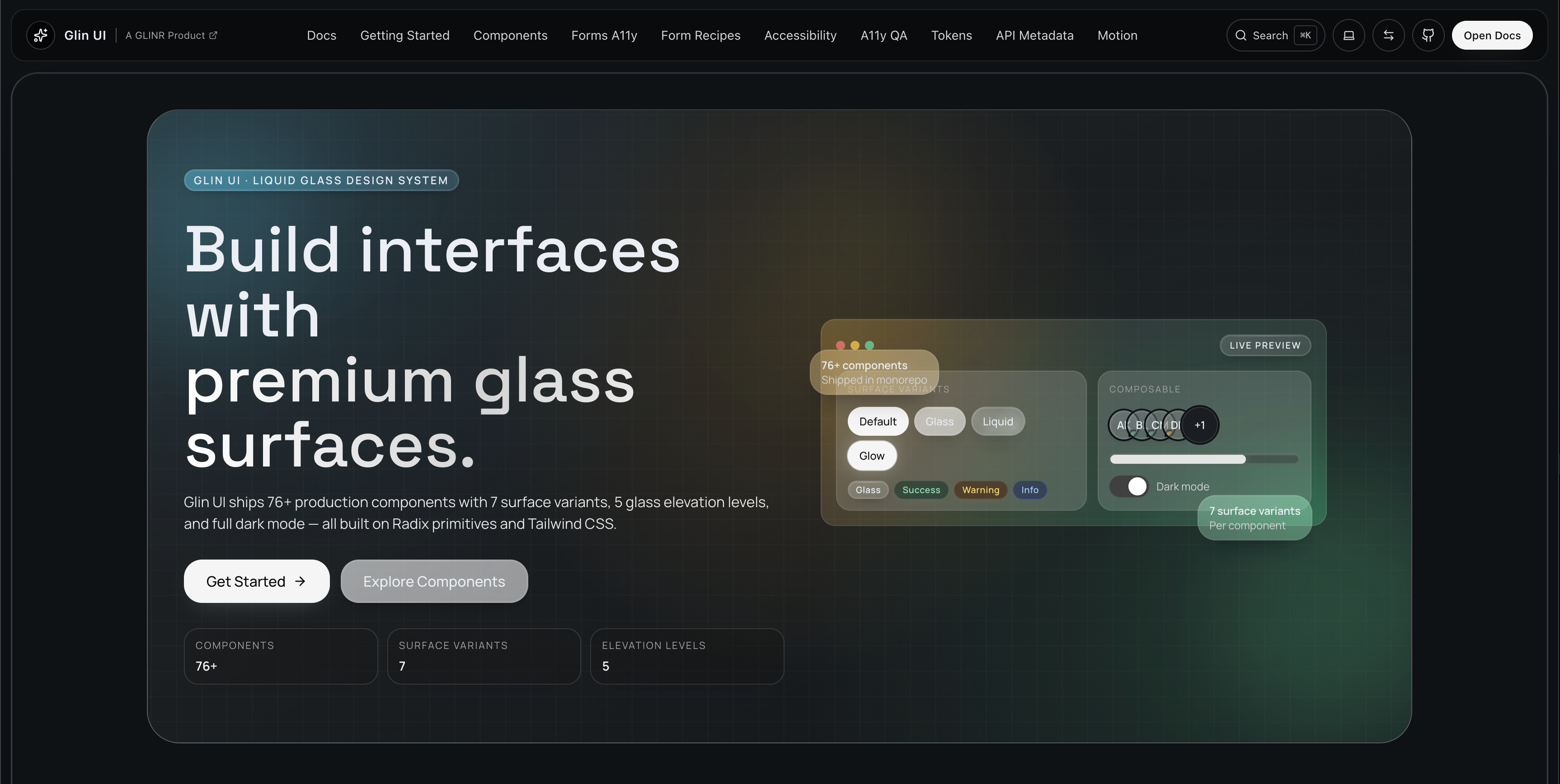
77 production components · 7 surface variants · 5 glass elevation levels
Built on Radix UI and Tailwind CSS. Open source. Open code.
Get Started · Components · Tokens · Motion · Glass Physics
Glin UI is a glassmorphic React component library built on the Apple Liquid Glass design language. Every component ships with multiple surface variants alongside semantic color variants and full dark mode support.
Unlike shadcn/ui which only offers copy-paste, Glin UI gives you both paths:
| CLI (like shadcn) | Package (like Chakra/HeroUI) | |
|---|---|---|
| Install | npx glinui add button |
npm i @glinui/ui |
| Ownership | Full — edit the source | Import — get updates via npm |
| Best for | Custom design systems | Ship fast, stay updated |
npx glinui init
npx glinui add button glass-card inputnpm install @glinui/ui @glinui/tokensimport { Button, GlassCard, Input } from "@glinui/ui"
import "@glinui/tokens/theme.css"
export default function App() {
return (
<GlassCard>
<Input variant="glass" placeholder="Email" />
<Button variant="glass">Glass</Button>
<Button variant="liquid">Liquid</Button>
<Button variant="glow">Glow</Button>
</GlassCard>
)
}Every component supports up to 7 surface variants through a single variant prop:
<Button variant="default">Default</Button>
<Button variant="glass">Glass</Button>
<Button variant="liquid">Liquid</Button>
<Button variant="matte">Matte</Button>
<Button variant="glow">Glow</Button>
<Button variant="outline">Outline</Button>
<Button variant="ghost">Ghost</Button>
Plus semantic variants for feedback:
<Alert variant="success">Saved successfully</Alert>
<Alert variant="warning">Check your input</Alert>
<Alert variant="destructive">Something went wrong</Alert>
<Alert variant="info">Tip: try the glass variant</Alert>5 tokenized elevation levels control blur intensity, surface opacity, and shadow depth:
/* Level 1 — Subtle */
background: var(--glass-1-surface);
box-shadow: var(--glass-1-shadow);

/* Level 3 — Standard card */
background: var(--glass-3-surface);
box-shadow: var(--glass-3-shadow);

/* Level 5 — Modal/overlay */
background: var(--glass-5-surface);
box-shadow: var(--glass-5-shadow);
Each level pairs with blur tiers (--glass-blur-sm/md/lg/xl) and a top refraction highlight (--glass-refraction-top) for that authentic glass edge effect.
The signature effect: real-time SVG displacement mapping that refracts content behind glass surfaces.
import { useLiquidGlass } from "@glinui/ui"

function MyOverlay() {
  const { ref, svgFilter, style } = useLiquidGlass({
    displacement: 40,
    blur: 12,
    saturate: 1.8,
    profile: "squircle"
  })

  return (
    <>
      {svgFilter}
      <div ref={ref} style={style}>
        Content with real glass refraction
      </div>
    </>
  )
}- Chrome: SVG
feDisplacementMapfor true optical refraction - Safari/Firefox: CSS
backdrop-filterblur + saturate fallback - Reduced motion: Static blur, no animation
| Component | Variants | Key Features |
|---|---|---|
| Accordion | default, glass, outline, ghost, separated | CSS height animations, Radix-based |
| Alert | default, glass, liquid, matte, glow + semantic | Auto-icon, composable |
| Alert Dialog | default | Radix-based, destructive action confirmation |
| Avatar | default, glass, liquid, matte, glow | Status dots, AvatarGroup with overflow |
| Badge | default, glass, liquid, matte, glow + semantic | 3 sizes, rounded-full |
| Button | default, glass, liquid, matte, glow, outline, ghost | Hover lift, shimmer, press squish |
| Card | default, glass, outline, ghost | Header/Content/Footer composition |
| Checkbox | default | Radix-based, indeterminate support |
| Command | default | Keyboard-driven search palette |
| Data Table | default | Sort, search, paginate, select, column toggle |
| Dropdown Menu | default | Radix-based, full keyboard nav |
| Hover Card | default | Radix-based, configurable delays |
| Input | default, glass, outline, ghost, underline, filled | Focus ring animations |
| Modal | default | Radix Dialog with glass overlay |
| Popover | default | Anchored floating panel |
| Progress | default, glass | Linear + circular, tokenized sizes |
| Radio Group | default | Radix-based |
| Select | default | Radix-based with glass surface |
| Separator | default, glass, gradient, dashed, dotted | Label + icon support |
| Sheet | top, right, bottom, left | Slide panel with overlay |
| Skeleton | default, glass | Reduced motion fallback |
| Slider | default | Glass thumb/track |
| Switch | default | Radix-based |
| Table | default | Composable header/body/row/cell |
| Tabs | default | Radix-based |
| Textarea | default, glass, outline, ghost, underline, filled | Auto-height option |
| Toast | default, glass, matte + semantic | Sonner-powered, promise toasts |
| Tooltip | default | Radix-based |
| Tree | default, glass, outline, ghost | File tree, badges, links |
Chip · Code · Counter · Heading · Icon Frame · Kbd · Label · Link · Status Dot · Text
| Component | Description |
|---|---|
| Glass Card | Depth-aware blur with refraction edge highlights |
| Glass Navbar | Scroll-responsive translucent navigation bar |
| Glass Dock | macOS-style dock with proximity magnification |
| Glass Toggle | Toggle switch with liquid fill animation |
| Glass Breadcrumb | Pill-style breadcrumb with glass indicators |
| Liquid Button | Fluid hover lift with radial shine effect |
| Magnetic CTA | Subtle cursor-attraction on hover |
| Spotlight Card | Cursor-tracked radial spotlight effect |
| Depth Card | Parallax tilt with layered glass planes |
| Morphing Tabs | Smoothly sliding indicator between items |
| Floating Panel | Draggable glass panel with depth shadows |
| Ripple Button | Liquid ripple effect on press |
| Component | Description |
|---|---|
| Animated Gradient | Color-shifting gradient with warm/cool/aurora presets |
| Aurora Background | Floating gradient mesh with blurred blobs |
| Border Beam | Light beam traveling along container border |
| Blur Fade | Scroll-triggered entrance with blur + fade |
| Blur Spotlight | Cursor-following ambient glow |
| Chromatic Text | RGB channel splitting aberration |
| Dot Pattern | SVG dot grid background |
| Glow Border | Rotating conic-gradient glow |
| Gradient Mesh | Overlapping radial gradients |
| Light Leak | Lens flare overlay with drift animation |
| Marquee | Infinite scroll with pause-on-hover |
| Meteor Shower | Diagonal streaks for hero backgrounds |
| Number Ticker | Animated counter on scroll visibility |
| Orbiting Circles | CSS orbital animation with upright children |
| Particle Field | Ambient floating particles (CSS-only) |
| Prism Border | Animated rainbow refraction border |
| Pulsating Button | Pulsing glow ring for CTAs |
| Retro Grid | CSS perspective grid with scrolling lines |
| Reveal Text | Clip-path wipe animation on view |
| Ripple | Concentric expanding rings from center |
| Shimmer Button | Animated shimmer sweep overlay |
| Spotlight | Full-page highlight for onboarding |
| Text Reveal | Word-by-word opacity on scroll |
| Typewriter | Character-by-character with blinking cursor |
| Word Rotate | Cycling text animation |
The entire visual system is controlled via CSS custom properties from @glinui/tokens:
/* Glass surfaces — 5 elevation levels */
--glass-{1-5}-surface
--glass-{1-5}-shadow

/* Blur tiers */
--glass-blur-sm          /* 4px  — subtle */
--glass-blur-md          /* 12px — standard */
--glass-blur-lg          /* 24px — overlay */
--glass-blur-xl          /* 40px — modal */

/* Refraction */
--glass-refraction-top   /* Top border highlight */

/* Shadows */
--shadow-glass-sm/md/lg  /* Depth-matched glass shadows */

/* Colors — OKLCH */
--color-background       /* Page background */
--color-foreground       /* Primary text */
--color-accent           /* Brand accent */
--color-muted            /* Secondary text */
--color-destructive      /* Error state */
--color-success          /* Success state */
--color-warning          /* Warning state */

/* Motion */
--motion-fast            /* 150ms */
--motion-normal          /* 300ms */
--motion-slow            /* 500ms */
Full reference: glinui.com/docs/tokens
| Package | npm | Description |
|---|---|---|
@glinui/ui |
|
77 React components |
@glinui/tokens |
 |
OKLCH design tokens + CSS variables |
@glinui/motion |
 |
Animation presets + gesture utilities |
@glinui/registry |
 |
Component metadata for CLI |
glinui |
 |
CLI — npx glinui add |
glinui/
├── apps/
│   └── docs/                 # Next.js 15 docs site (glinui.com)
├── packages/
│   ├── ui/                   # 77 React components
│   ├── tokens/               # CSS design tokens (glass, color, motion)
│   ├── motion/               # Animation utilities + gesture presets
│   ├── registry/             # Component metadata for CLI
│   ├── cli/                  # glinui CLI (npx glinui add)
│   └── tsconfig/             # Shared TypeScript config
└── tooling/                  # Scripts, eslint, vitest configs
git clone https://github.com/GLINCKER/glinui.git
cd glinui
pnpm install

pnpm dev            # Docs on :3002
pnpm build          # Build all packages
pnpm typecheck      # TypeScript
pnpm test # 163 tests across all packages- React 19 + Next.js 15 (App Router, static export)
- Tailwind CSS with CSS custom properties
- Radix UI for accessible primitives
- class-variance-authority for type-safe variant composition
- Sonner for toast notifications
- Lucide for iconography
- Vitest + Testing Library for component testing
- pnpm + Turborepo for monorepo management
- Changesets for automated versioning + npm publish
- Cloudflare Pages for docs hosting
We welcome contributions! Please open an issue first to discuss what you'd like to change.
See our issue templates for bug reports and feature requests.
- Documentation — Full docs, API reference, live examples
- GitHub Discussions — Questions, ideas, show & tell
- Issue Tracker — Bug reports and feature requests
MIT © Glincker
Built by Glincker · Powered by Liquid Glass